Kristy Taylor
DESIGN DIRECTOR | BRAND & PACKAGING

MATY'S REBRAND
As part of Maty's evolution into an ecommerce-focused pediatric wellness brand, I co-led the redesign of the brand architecture and packaging portfolio. While the brand serves the entire family, the refreshed strategy was designed to resonate more deeply with parents of babies and young children. Guided by multiple rounds of consumer research and testing, the rebrand transformed the packaging from fragmented and outdated to modern, premium, and cohesive—creating a stronger shelf presence and scalable design system that builds brand equity across the portfolio.

LOGO REDESIGN
To better connect with modern parents, the Maty's logo was redesigned to be more confident, friendly, and recognizable. The leaf integrated into the apostrophe creates a unique brand identifier while communicating the natural, wholesome values at the heart of the brand.
PACKAGING DESIGN


A key challenge of the redesign was creating distinct packaging experiences for each age category while maintaining a cohesive portfolio architecture. To solve this, I developed the overarching "Grow Together" concept—a visual and strategic framework that reflects how families can discover and grow with Maty's natural remedies through every stage of life. With ecommerce as a primary consideration, the packaging was intentionally designed with a clean, minimal front panel, allowing key benefits to stand out while leveraging PDP content to deliver deeper product education and support the online shopping experience.
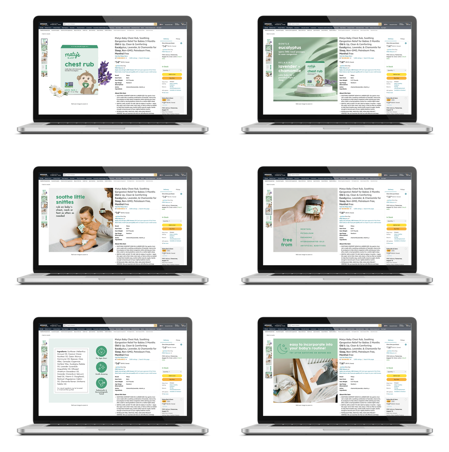
AMAZON PDP
Designed to complement the streamlined packaging system, the Amazon PDP experience served as a critical extension of the brand story. Strategic content hierarchy, educational messaging, and visual storytelling were leveraged to provide consumers with deeper product insights, strengthen brand differentiation, and justify a premium positioning within a competitive category.
